Showing Real-Time Risk & Alerts in Supply Chain
Showing the Risks
& Real-Time Alerts
Supply chain alerts like cyclones lead to financial losses due to delayed risk visibility and lack of insights.
Problem
Real-time risk visibility system that delivers timely alerts, impacts and mitigation strategies to shippers and carriers.
Solution
Faster decision-making, reduced financial losses, and an improved supply chain efficiency.
Impacts
4 weeks (Final release in Mar - 2024)
Duration
Christopher G (Sr. UX Manager) Mathilda Jerome (Lead UXD) Me (UXD)
My Team
Iterative design / User study / Interaction and UI design.
My Roles
Zeno Health saw really low conversions on generics, with people picking the branded meds which reduced our profit margins.
Problem
Introduced motivator highlighting the low cost generic, increasing generic sales from 1.2% to 4.1%.
Solution and Impacts
4 weeks (Final release in Mar - 2024)
Duration
Product research / User testing / Visuals, UI and copywriting.
My Roles
Problem of delayed visibility
Problem of delayed visibility
Problem of delayed visibility
Problem statement
Supply chains power global commerce but are vulnerable to disruptions like storms, port closures, and geopolitical tensions, causing delays and losses. Businesses don’t lack data. They lack real-time insights.
Problem statement
Supply chains power global commerce but are vulnerable to disruptions like storms, port closures, and geopolitical tensions, causing delays and losses. Businesses don’t lack data. They lack real-time insights.
Problem statement
Supply chains power global commerce but are vulnerable to disruptions like storms, port closures, and geopolitical tensions, causing delays and losses. Businesses don’t lack data. They lack real-time insights.
Understanding the gaps
Despite advancements in supply chain visibility, few key challenges prevents various businesses from proactively mitigating risks:
Understanding the gaps
Despite advancements in supply chain visibility, few key challenges prevents various businesses from proactively mitigating risks:
Understanding the gaps
Despite advancements in supply chain visibility, few key challenges prevents various businesses from proactively mitigating risks:
Switch to PC/Tab to know the design process
Switch to PC/Tab to know the design process
Switch to PC/Tab to know the design process
Switch to PC/Tab to know the design process
Delayed
Inconsistent updates and less insights.
Delayed
Inconsistent updates and less insights.
Delayed
Inconsistent updates and less insights.
Slow
Poor and slow coordination in critical points.
Slow
Poor and slow coordination in critical points.
Slow
Poor and slow coordination in critical points.
Limited
Lacks A.I. Driven forecasting and resolutions.
Limited
Lacks A.I. Driven forecasting and resolutions.
Limited
Lacks A.I. Driven forecasting and resolutions.
Unreliable
Unreliable and false data along with insights.
Unreliable
Unreliable and false data along with insights.
Unreliable
Unreliable and false data along with insights.
Aim and vision - Giving real-time insights
Aim and vision - Giving real-time insights
Aim and vision - Giving real-time insights
Vision of higher-ups
The idea was of a design that doesn’t just notify a user of disruptions but highlights losses upfront, ensuring swift, informed action to minimize risks. To achieve this, we needed to place the alerts where users naturally interact, i.e-their workspace. Since every second matters, the risks had to be above the fold, ensuring they were seen instantly.
User needs - Who we designed for?
User needs - Who we designed for?
User needs - Who we designed for?
User groups
Our users (most stakeholders and managers) span at different roles in supply chain management, each with unique needs.
User groups
Our users (most stakeholders and managers) span at different roles in supply chain management, each with unique needs.
User groups
Our users (most stakeholders and managers) span at different roles in supply chain management, each with unique needs.
1
Shippers (Manufacturer & Retailers) -
Need to ensure on-time delivery and minimize losses.
1
Shippers (Manufacturer & Retailers) -
Need to ensure on-time delivery and minimize losses.
1
Shippers (Manufacturer & Retailers) -
Need to ensure on-time delivery and minimize losses.
2
Carriers (Logistics Providers & Freight Operators) -
Require efficient routing and risk avoidance.
2
Carriers (Logistics Providers & Freight Operators) -
Require efficient routing and risk avoidance.
2
Carriers (Logistics Providers & Freight Operators) -
Require efficient routing and risk avoidance.
3
Supply Chain Managers & Analysts -
Depend on real-time insights to make informed decisions.
3
Supply Chain Managers & Analysts -
Depend on real-time insights to make informed decisions.
3
Supply Chain Managers & Analysts -
Depend on real-time insights to make informed decisions.
4
Executives & Finance Teams (High authorities/managers) -
Focus on reducing financial risks and operational inefficiencies.
4
Executives & Finance Teams (High authorities/managers) -
Focus on reducing financial risks and operational inefficiencies.
4
Executives & Finance Teams (High authorities/managers) -
Focus on reducing financial risks and operational inefficiencies.
Brainstorming and Quantitative Insights
Brainstorming and Quantitative Insights
Brainstorming and Quantitative Insights
Brainstorming for quantity
We (8 UXD + 1 Sr. UX Manager) explored multiple approaches through brainstorming to answer questions such as what would happen by widget, visual language, types of UI patterns or any innovtive ideas.
Brainstorming for quantity
We (8 UXD + 1 Sr. UX Manager) explored multiple approaches through brainstorming to answer questions such as what would happen by widget, visual language, types of UI patterns or any innovtive ideas.
Brainstorming for quantity
We (8 UXD + 1 Sr. UX Manager) explored multiple approaches through brainstorming to answer questions such as what would happen by widget, visual language, types of UI patterns or any innovtive ideas.
Elements that would go in the design
We decided on widget structure, since it was highly visible and could be integrated into the existing screens & system. To determine the content inside, I met with PMs and conducted user calls to gather and prioritize insights.
Elements that would go in the design
We decided on widget structure, since it was highly visible and could be integrated into the existing screens & system. To determine the content inside, I met with PMs and conducted user calls to gather and prioritize insights.
Elements that would go in the design
We decided on widget structure, since it was highly visible and could be integrated into the existing screens & system. To determine the content inside, I met with PMs and conducted user calls to gather and prioritize insights.
Iterations on the widget
Iterations on the widget
Iterations on the widget
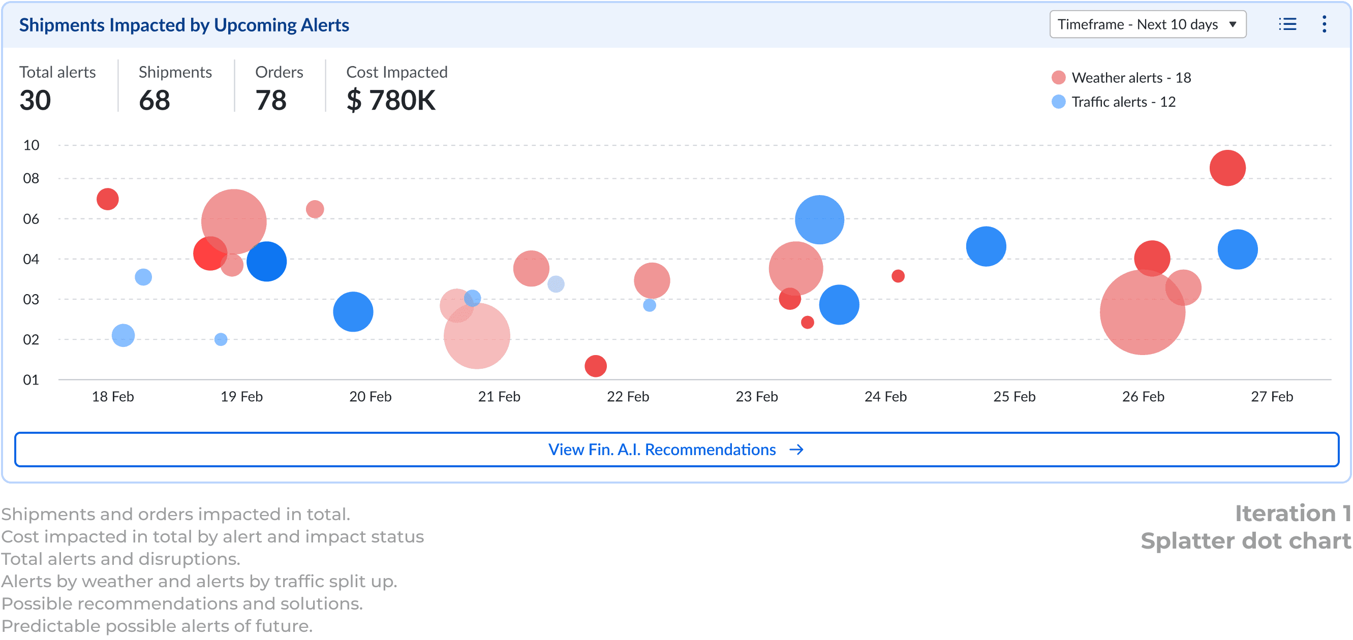
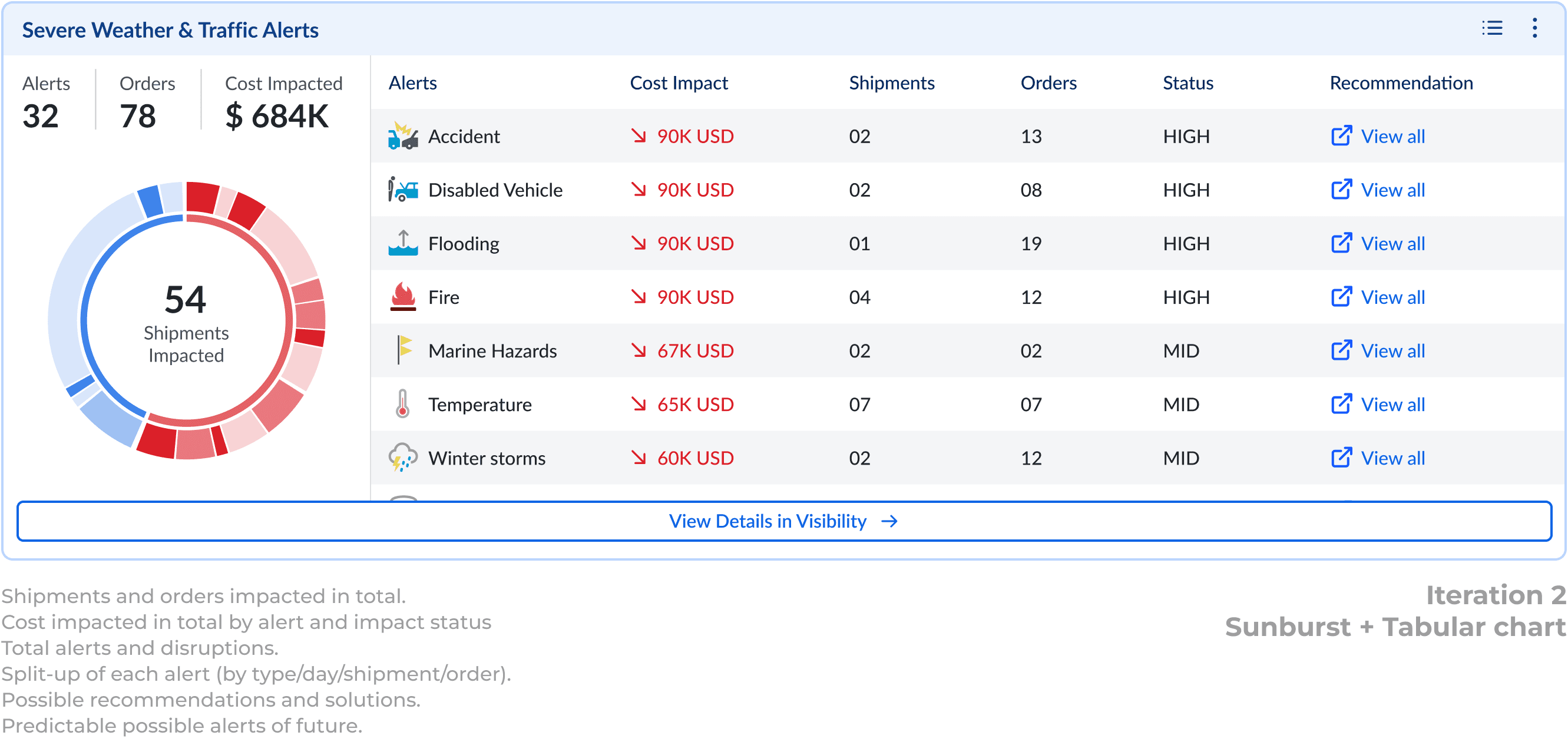
4 main iterations (out of other 8)
Through multiple wireframing and iterative cycles, I tested various designs such as bar graph, pie, sunburst, dot, map and list/card views, ensuring the alerts were clear without overwhelming the users.
4 main iterations (out of other 8)
Through multiple wireframing and iterative cycles, I tested various designs such as bar graph, pie, sunburst, dot, map and list/card views, ensuring the alerts were clear without overwhelming the users.
4 main iterations (out of other 8)
Through multiple wireframing and iterative cycles, I tested various designs such as bar graph, pie, sunburst, dot, map and list/card views, ensuring the alerts were clear without overwhelming the users.

Picking the map view for adaptability
Picking the map view for adaptability
Picking the map view for adaptability
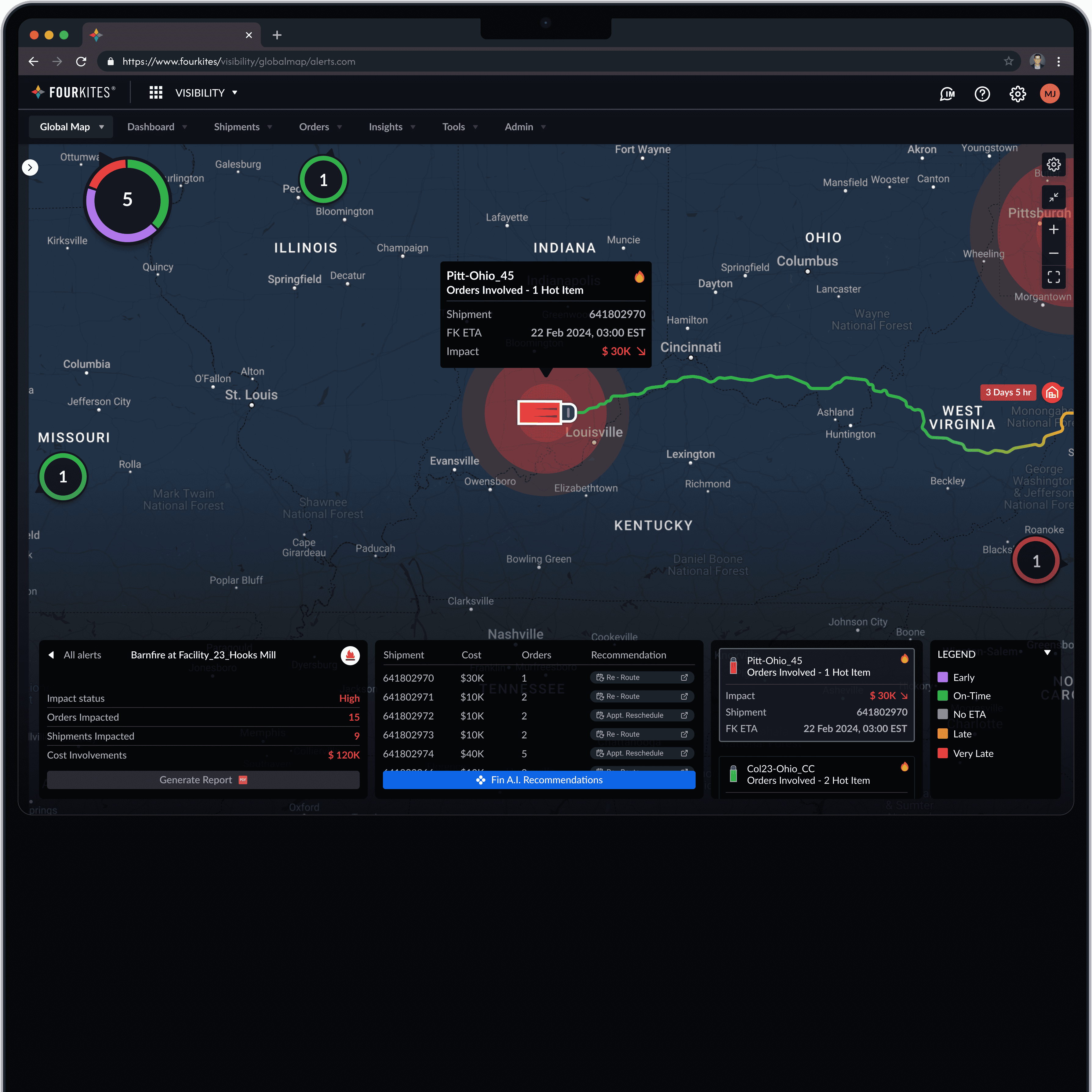
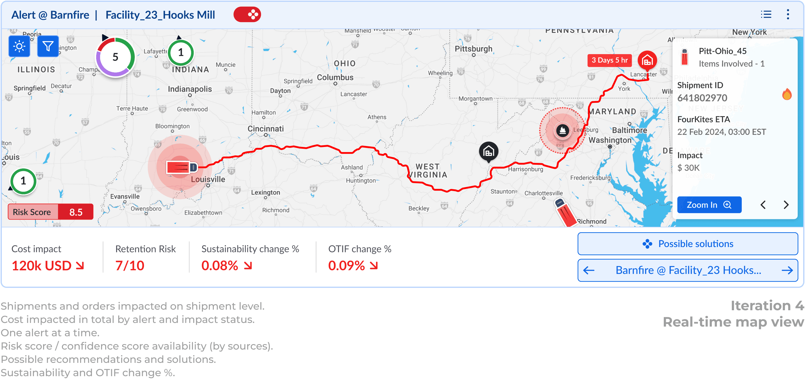
Final pick - Map view (but needed to be polished)
Internal feedback on the iterations was positive, but the "4+ days timeframe" did not work well and was removed due to A.I and few backend constraints. Finally, the map view stood out as promising, innovative, and highly adaptable.
Final pick - Map view (but needed to be polished)
Internal feedback on the iterations was positive, but the "4+ days timeframe" did not work well and was removed due to A.I and few backend constraints. Finally, the map view stood out as promising, innovative, and highly adaptable.
Final pick - Map view (but needed to be polished)
Internal feedback on the iterations was positive, but the "4+ days timeframe" did not work well and was removed due to A.I and few backend constraints. Finally, the map view stood out as promising, innovative, and highly adaptable.
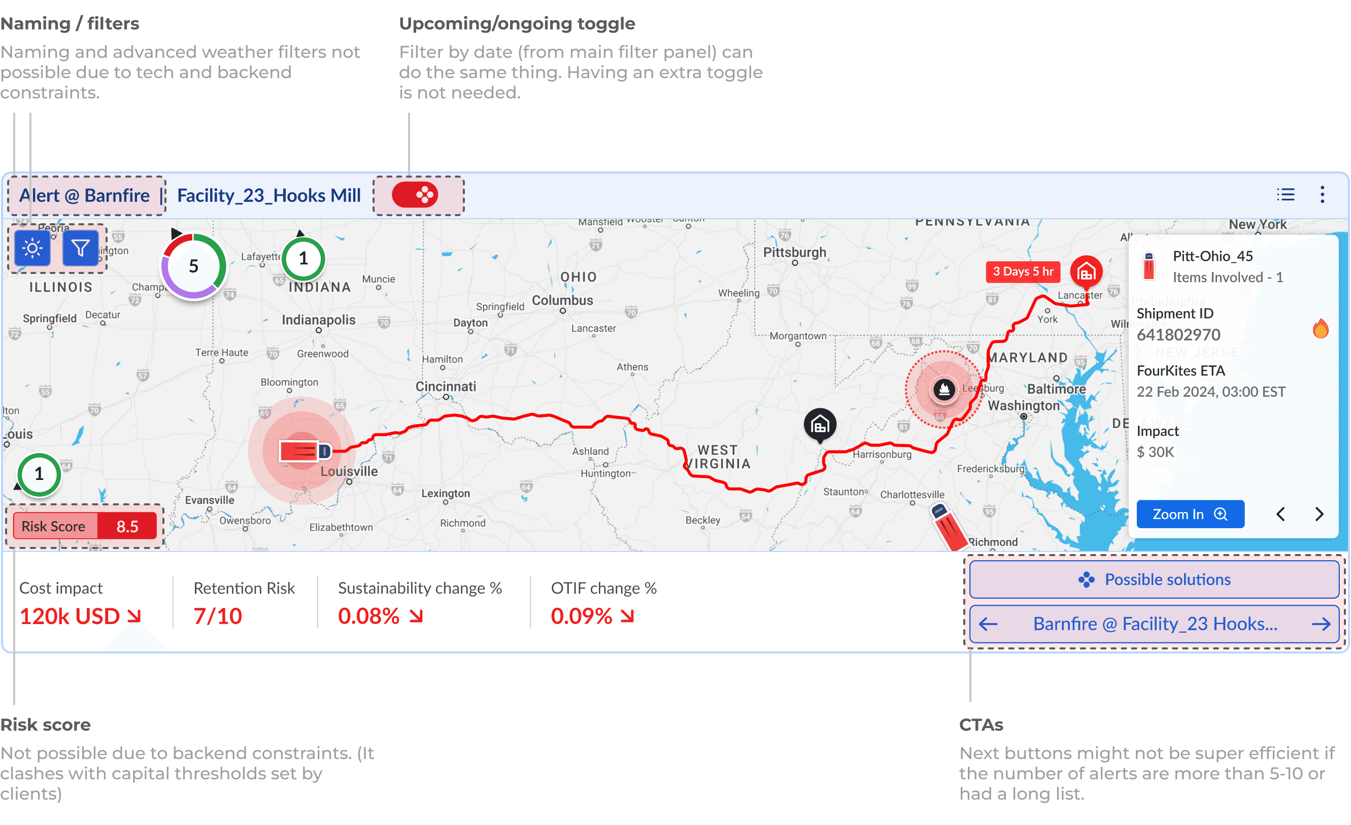
Elements that needed to be fixed
Within the map iteration, a few elements and patterns alongside CTA's needed to be cleaned and polished as per the needs of users, and backend constraints.
Elements that needed to be fixed
Within the map iteration, a few elements and patterns alongside CTA's needed to be cleaned and polished as per the needs of users, and backend constraints.
Elements that needed to be fixed
Within the map iteration, a few elements and patterns alongside CTA's needed to be cleaned and polished as per the needs of users, and backend constraints.

Prioritizing the user levels
Based on feedback and issues, I realized prioritizing data wasn’t enough. I needed to prioritize users and tailor the experience only for a specific user types.
Prioritizing the user levels
Based on feedback and issues, I realized prioritizing data wasn’t enough. I needed to prioritize users and tailor the experience only for a specific user types.
Prioritizing the user levels
Based on feedback and issues, I realized prioritizing data wasn’t enough. I needed to prioritize users and tailor the experience only for a specific user types.
Priority 1
Supply chain managers and analysts.
Priority 1
Supply chain managers and analysts.
Priority 1
Supply chain managers and analysts.
Priority 2
Shippers and executives of the brands.
Priority 2
Shippers and executives of the brands.
Priority 2
Shippers and executives of the brands.
Priority 3
Operational teams and other manager levels.
Priority 3
Operational teams and other manager levels.
Priority 3
Operational teams and other manager levels.
Priority 4
Carriers, finance and yard level people.
Priority 4
Carriers, finance and yard level people.
Priority 4
Carriers, finance and yard level people.
Polishing the design and user testing for insights
Polishing the design and user testing for insights
Polishing the design and user testing for insights
Dark mode as default view
The design initially aimed for light colors to blend with widgets. But with 87%+ users favoring dark mode in our other products, I decided to shift to dark mode as default for consistency and clarity, with light and satellite options available.
Dark mode as default view
The design initially aimed for light colors to blend with widgets. But with 87%+ users favoring dark mode in our other products, I decided to shift to dark mode as default for consistency and clarity, with light and satellite options available.
Dark mode as default view
The design initially aimed for light colors to blend with widgets. But with 87%+ users favoring dark mode in our other products, I decided to shift to dark mode as default for consistency and clarity, with light and satellite options available.
Light
Dark

Light
Dark
Light
Dark
Key Insights in user behaviors
Despite user acceptance, UX team recorded user screens and the analysis revealed unexpected (yet natural) behavior -
Key Insights in user behaviors
Despite user acceptance, UX team recorded user screens and the analysis revealed unexpected (yet natural) behavior -
Key Insights in user behaviors
Despite user acceptance, UX team recorded user screens and the analysis revealed unexpected (yet natural) behavior -
1
Users who started from workspace (11/50) -
These users started from workspace, and could go through the widgets.
1
Users who started from workspace (11/50) -
These users started from workspace, and could go through the widgets.
1
Users who started from workspace (11/50) -
These users started from workspace, and could go through the widgets.
2
Card view users (16/50) -
These users always used card view, and barely visited the workspace.
2
Card view users (16/50) -
These users always used card view, and barely visited the workspace.
2
Card view users (16/50) -
These users always used card view, and barely visited the workspace.
3
List view users (11/50) -
These users always used list view, and barely visited the workspace.
3
List view users (11/50) -
These users always used list view, and barely visited the workspace.
3
List view users (11/50) -
These users always used list view, and barely visited the workspace.
4
Shared users (12/50) -
Depend on colleagues’ systems for access.
4
Shared users (12/50) -
Depend on colleagues’ systems for access.
4
Shared users (12/50) -
Depend on colleagues’ systems for access.
5
Users who resumed from where they left off (22/50) -
These users required continuity in their workflow and avoided switching screen.
5
Users who resumed from where they left off (22/50) -
These users required continuity in their workflow and avoided switching screen.
5
Users who resumed from where they left off (22/50) -
These users required continuity in their workflow and avoided switching screen.
Adapting to the user's behavior and habits
Adapting to the user's behavior and habits
Adapting to the user's behavior and habits
Challenge
As the list and card views were very common, I needed to adapt the widget style for these layouts. However, both were already very data-dense, leaving no space for any new UI pattern addition, or a widget.
Challenge
As the list and card views were very common, I needed to adapt the widget style for these layouts. However, both were already very data-dense, leaving no space for any new UI pattern addition, or a widget.
Challenge
As the list and card views were very common, I needed to adapt the widget style for these layouts. However, both were already very data-dense, leaving no space for any new UI pattern addition, or a widget.
Solution - Integrating rather than adding
To integrate alerts without disrupting existing visuals, I replaced the widget with a mini alert icon next to "Status of Shipment", offering quick, simple overlay data view on hover. This seamlessly blended alerts into card and list views.
Solution - Integrating rather than adding
To integrate alerts without disrupting existing visuals, I replaced the widget with a mini alert icon next to "Status of Shipment", offering quick, simple overlay data view on hover. This seamlessly blended alerts into card and list views.
Solution - Integrating rather than adding
To integrate alerts without disrupting existing visuals, I replaced the widget with a mini alert icon next to "Status of Shipment", offering quick, simple overlay data view on hover. This seamlessly blended alerts into card and list views.

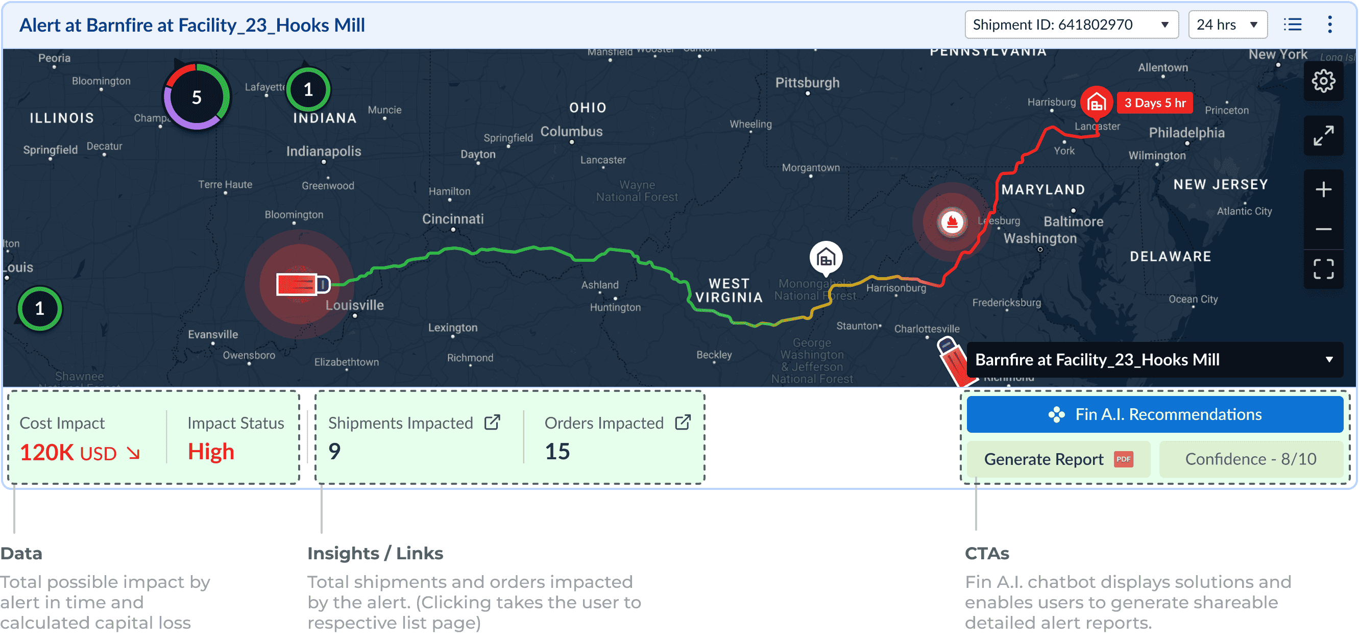
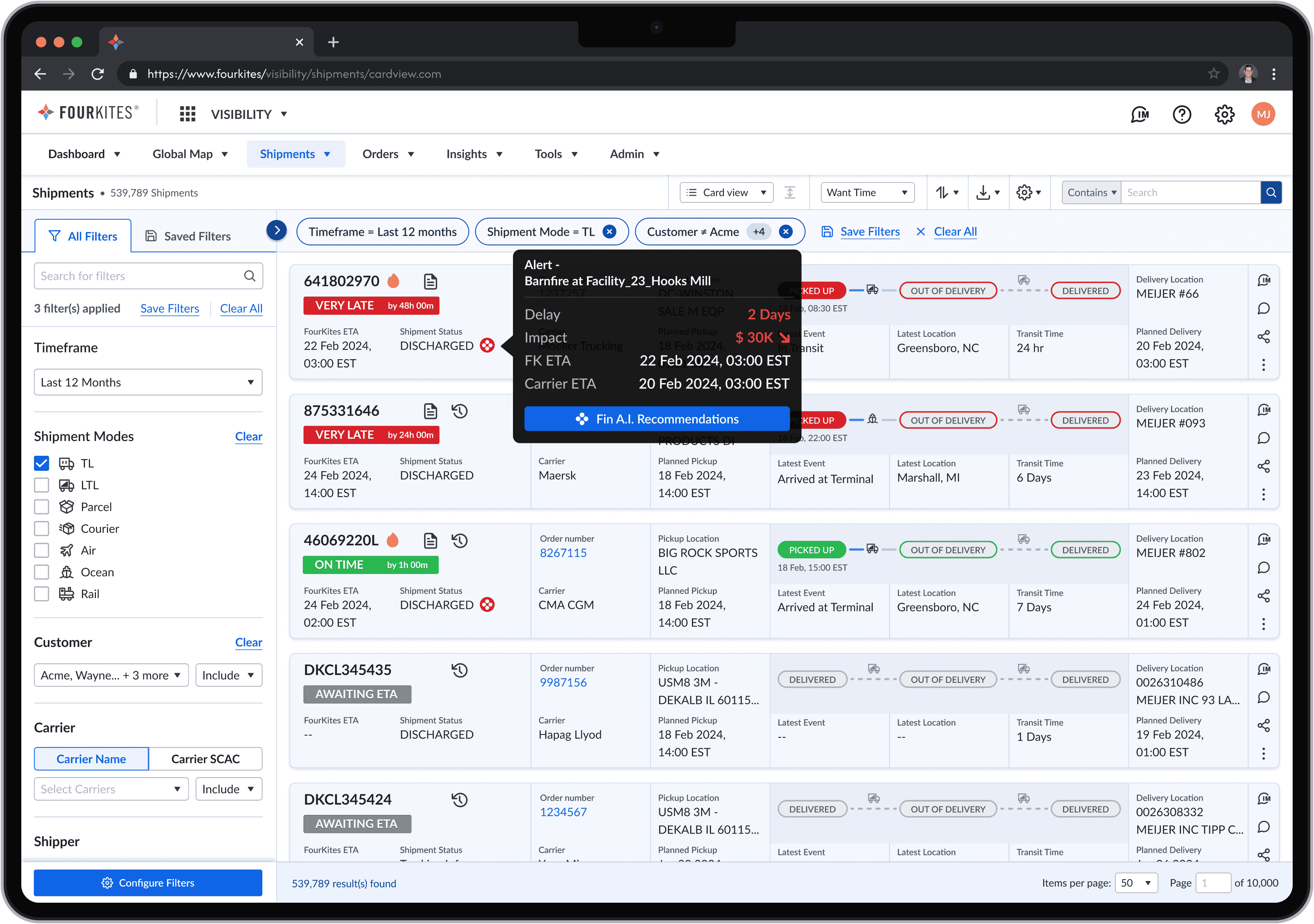
Final Design
Final Design
Data at a glance
All critical alerts, risks and shipments impact data is centralized in global map view, providing users with quick insights.
Data at a glance
All critical alerts, risks and shipments impact data is centralized in global map view, providing users with quick insights.
Data at a glance
All critical alerts, risks and shipments impact data gets centralized in global map view.


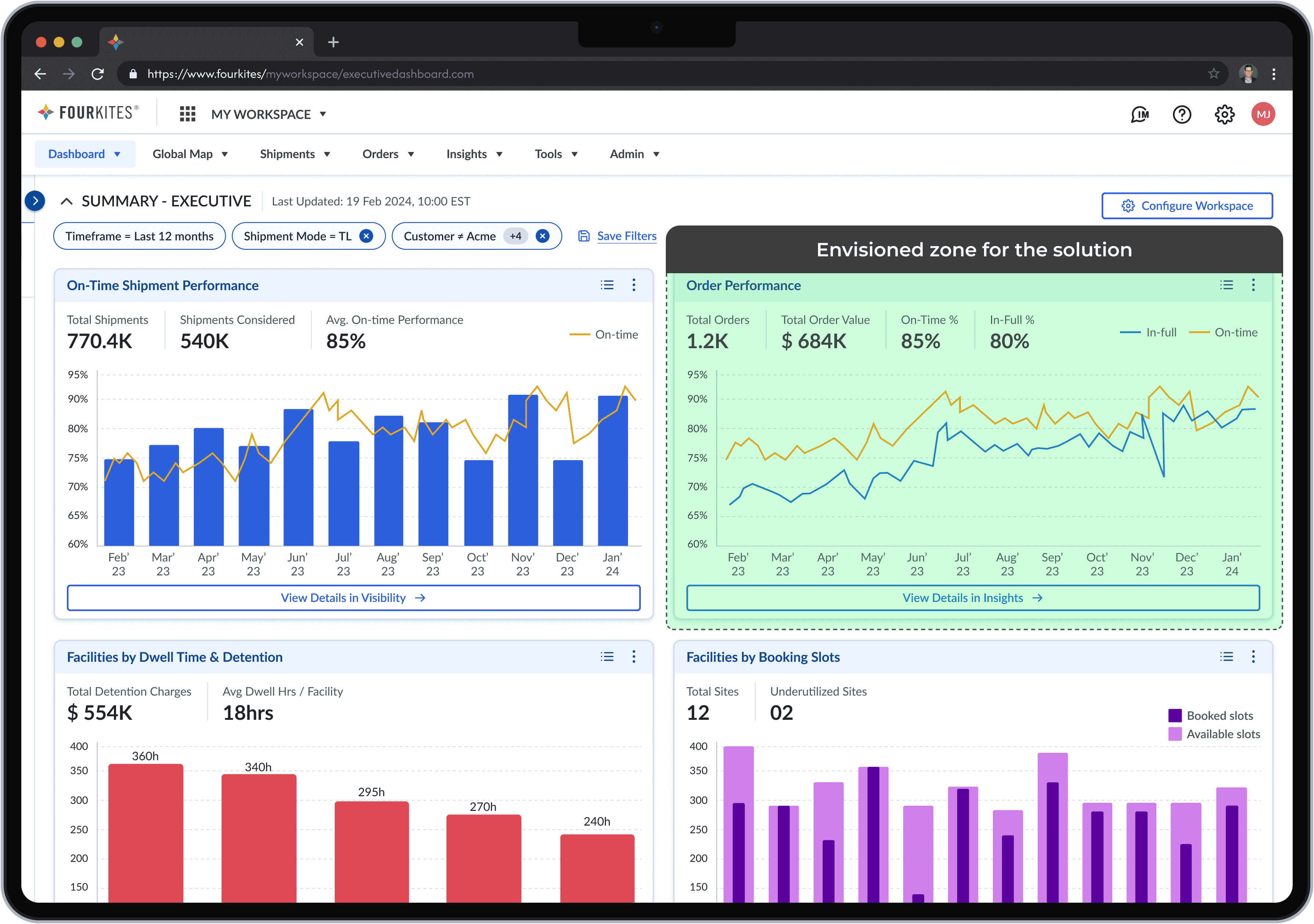
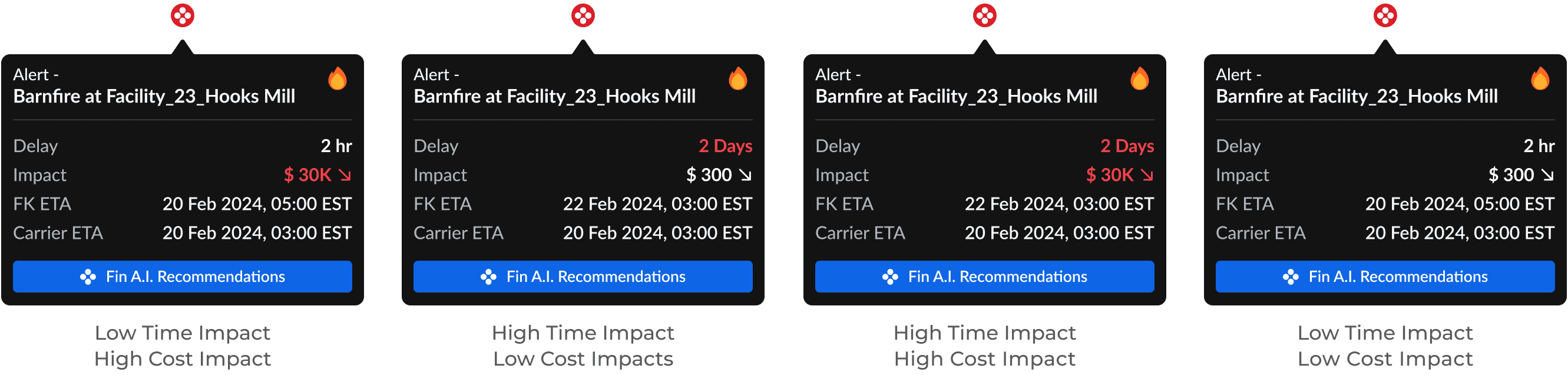
Visual driven widget
The widget presents data and insights with a simple UI, minimizing cognitive load while delivering information to the user.
Visual driven widget
The widget presents data and insights with a simple UI, minimizing cognitive load while delivering information to the user.
Visual driven widget
The widget presents data and insights with a simple UI, reducing the cognitive loads while also delivering information.
Light
Dark


Light
Dark
Light
Dark
Integrating into card and list view
The tooltips approach allows the design to be integrated seamlessly into user's most used screens on which they spent their time.
Integrating into card and list view
The tooltips approach allows the design to be integrated seamlessly into user's most used screens on which they spent their time.
Integrating into card and list view
The tooltips approach allows the design to be integrated into, the most used screens by the users of FourKites.
List view
Card view
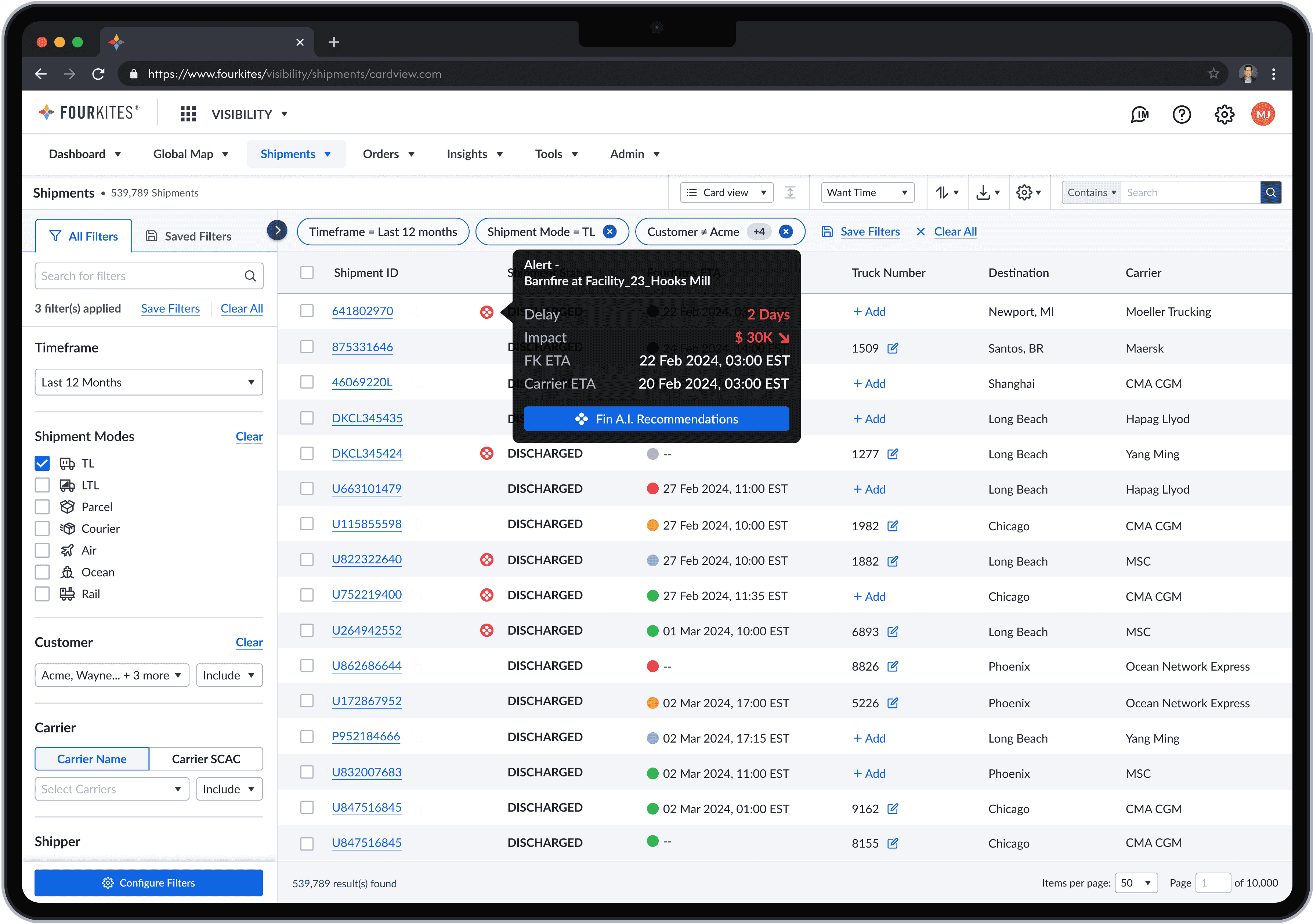
List view
Card view
List view
Card view
Impact and the Lessons
Impacts
Collaborating with the managers, I recognized the impact of design, for one product can affect multiple designs and system. I also learned, why its a need to test designs across various contexts and adapt quickly to ever evolving user habits.
Collaborating with the managers, I recognized the impact of design, for one product can affect multiple designs and system. I also learned, why its a need to test designs across various contexts and adapt quickly to ever evolving user habits.
Collaborating with my manager, I recognized the impact of design in one screen can affect multiple other systems. I also learned, why its needed to test the designs, on other contexts and adapt quickly.
Average NPS scores increased in first month for the MW product.
6.5
to
7.5
+ 1.0
in 60 days
Average NPS scores increased in first month for the MW product.
6.5
to
7.5
+ 1.0
in 60 days
Average NPS scores increased in first month for the MW product.
6.5
to
7.5
+ 1.0
in 60 days
23.1% of the overall users on MW interacted with this widget.
23.1%
Usage
N/A
in 60 days
23.1% of the overall users on MW interacted with this widget.
23.1%
Usage
N/A
in 60 days
23.1% of the overall users on MW interacted with this widget.
23.1%
Usage
N/A
in 60 days
Major impacts was unclear due to confidential customer and year end financial data.
Major impacts was unclear due to confidential customer and year end financial data.
Major impacts is unclear due to confidential customer and year end financial data.
It was a little more chaotic process. Curious? Let’s talk. 🤓
It was a little more chaotic process. Curious? Let’s talk. 🤓
Wanna know more? Let’s talk. 🤓